Color in an environment is everything. Whether you’re thinking about strong colors or neutrals these have the power to influence things like space, aesthetics, and even your mood. It has been the subject of numerous studies and theories. Basic color theory has several definitions, concepts, and ways to apply it in design, the amount of information is infinite.
Nevertheless, we’re introducing you to some of the basics in color theory: the Color Wheel, color harmony, and the techniques that can come in very handy when thinking about redoing a space in your home, basically helping you determine which colors work well together.
The possibilities are endless, so don’t be afraid to experiment with color. At Casapitti we love that you love our beautiful Made in Italy furniture, all handmade pieces. They all work beautifully in every space in your home and we want you to feel comfortable when combining colors for your space.
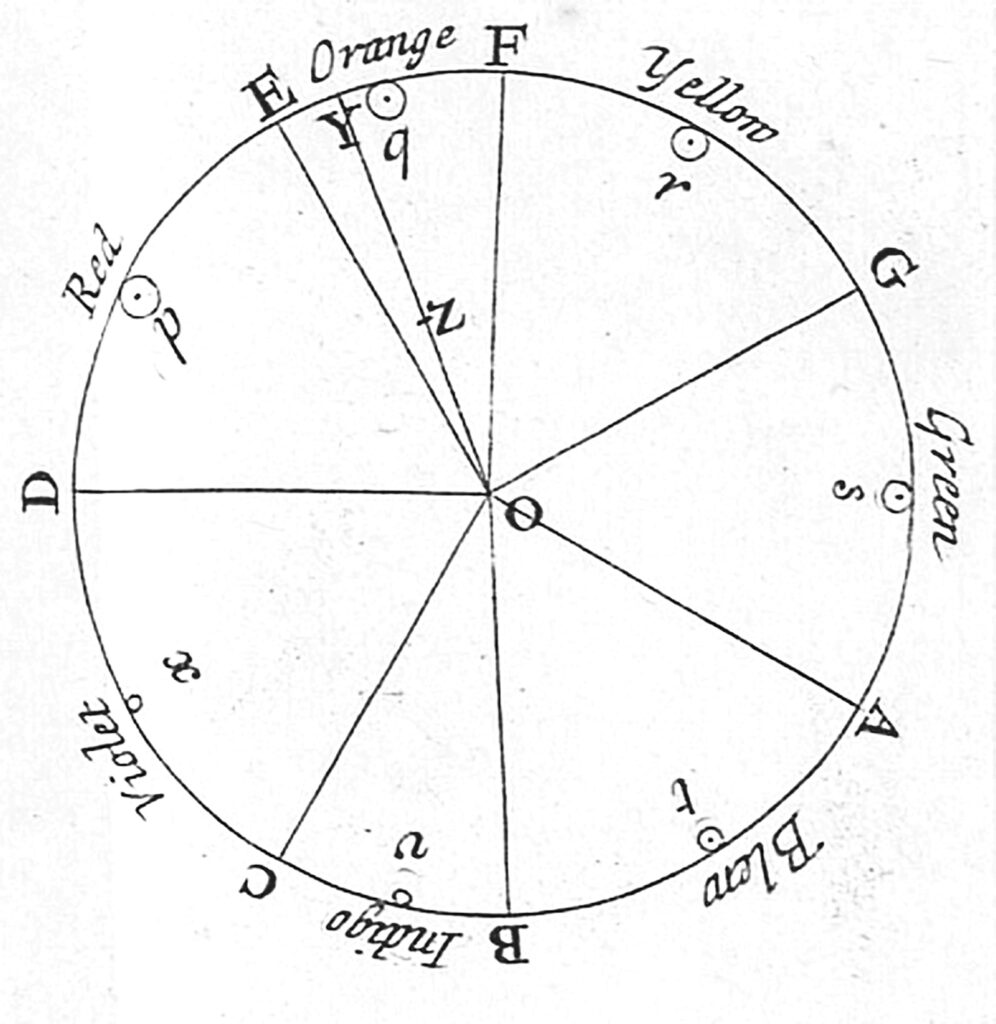
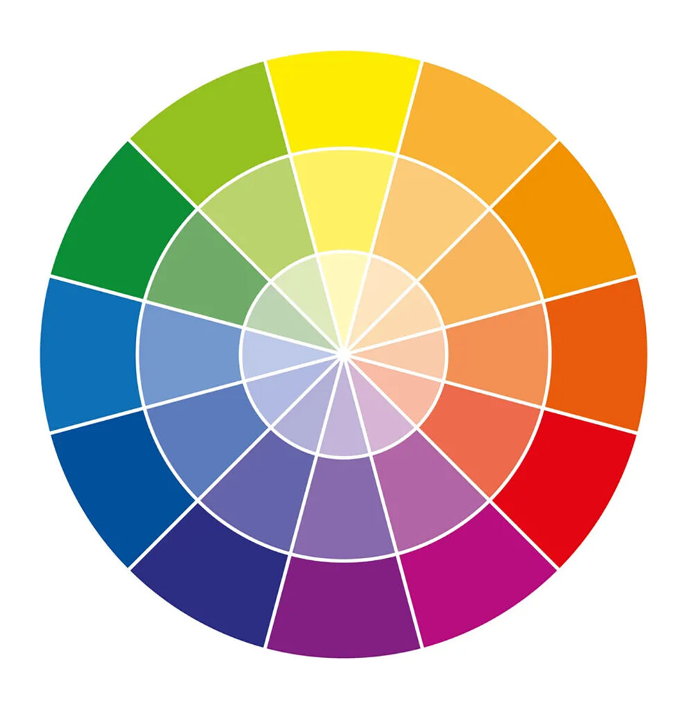
The color wheel is a visual representation of colors arranged in a circular form and their hues arranged in a wavelength. It dates back to Sir Isaac Newton’s period, he created the first one in 1666 by observing colors and the way they changed in a different light, since then scientists, artists, and designers have not only used it but also created variations from the original one.
The basic one is the RYB or red, yellow, and blue color wheel, it is usually applied by designers and artists, as it helps with combining paint colors. It uses these three colors as primary colors, and by combining them you obtain secondary colors: purple, orange, and green.
Even though these color combinations are seen as something elementary it’s still immensely useful when thinking about combining colors.
And now the tertiary Colors, which are the ones not everyone is familiar with, which are: yellow-orange, red-orange, red-purple, blue-purple, blue-green & yellow-green are obtained by mixing a primary and a secondary color.
You can also obtain shades, tints, and tones when adding white, black or gray to the base color (shades when adding black, tint when adding white, and tone when adding gray).
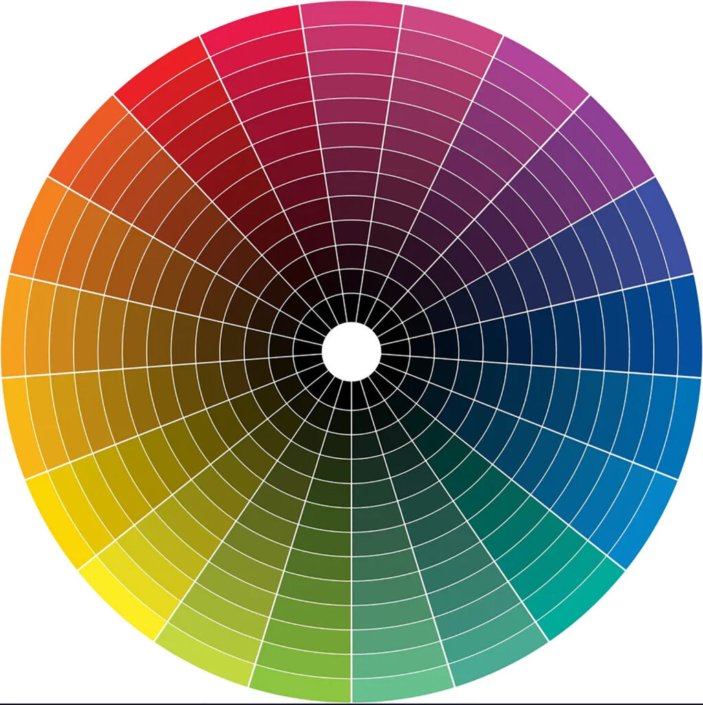
The color wheel can also be divided into warm and cool colors: cool colors go from blue to green and purple (including their hues) while warm colors go from red, orange, and yellow (and their respective hues). In the chromatic circle, the colors on the outside are rather dark and as you go down towards the inside of the circle the colors become lighter and lighter.
According to color psychology, different color temperatures can evoke different moods and feelings. For example, warm colors are said to bring to mind coziness and energy, while cool colors are associated with serenity and isolation.
Now that you’ve got the main idea about colors and the color wheel, let’s move into color harmony. When a set of colors look good together they’re in harmony. By using the color wheel whether it’s the base colors, or each of their shades, tones, and tints you can determine if they are pleasant together.
Three techniques you can use to find color harmony in your living space are:
Monochromatic Shades and Tints
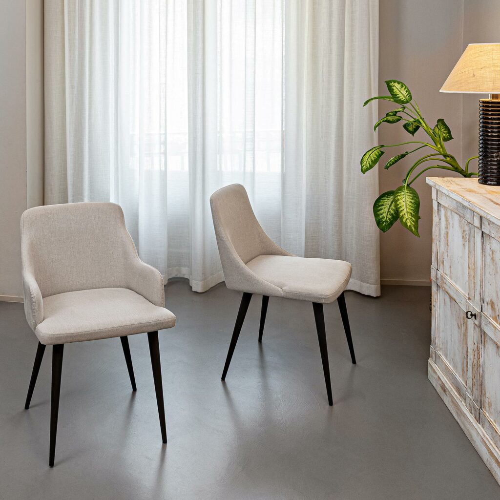
To use this technique start by choosing a base color, it’s better if you choose the darker version of the color you decide and then descend into your circle of colors to find the lighter shades that make up your decor. Monochromatic hues are ideal for rest areas. For instance, if you decide to paint a wall in your living room beige, you can choose a gorgeous chair like our Marina chair in Linen Flax fabric, a shade lighter than the wall but still a couple of shades darker than the curtains. You can also combine different materials to make everything more sophisticated.
Harmony Colors in Similar Shades and Tints
When talking about harmonious colors in similar shades and tints we refer to the colors that are next to each other on the color wheel. This technique is a bit more sophisticated than the monochromatic technique we mentioned previously. You can choose a color and the colors that surround it in the color wheel. It’s said that combining these colors bring harmony since the contrast is minimal and harmoniously coexists with each other. Interesting effects will be achieved by playing with different shades (brightness level), this will bring a more contemporary style to your decor. For example, if you choose ochre as the main color you can add orange and vermilion in lighter shades when adding details. Take a look at our gorgeous Flavio dining table, with its super-resistant porcelain top in marble finish and leg frame in driftwood that works beautifully in its environment, the wall and floor colors coexist in perfect harmony.
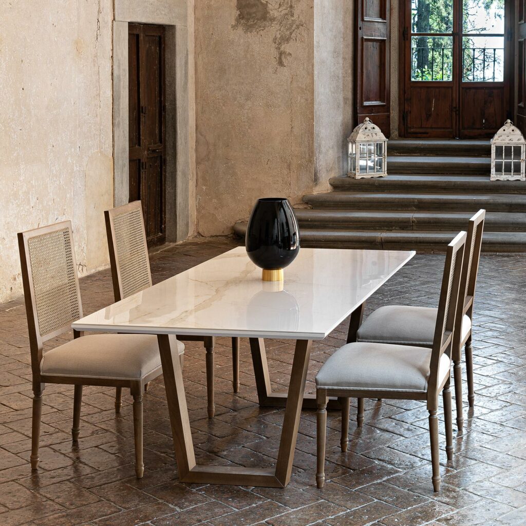
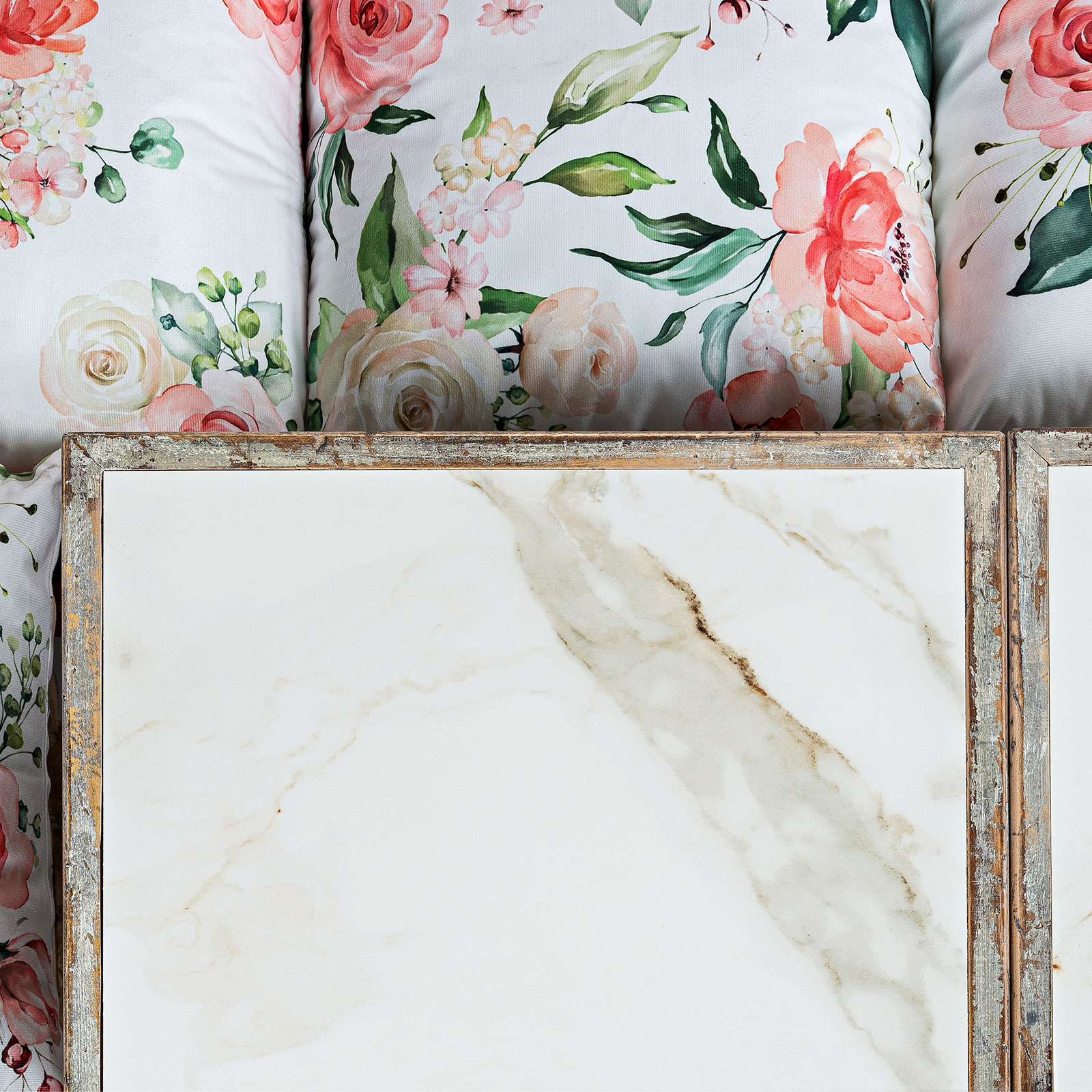
Our gorgeous Flavio dining table with porcelain top in a marble finish.
Contrast
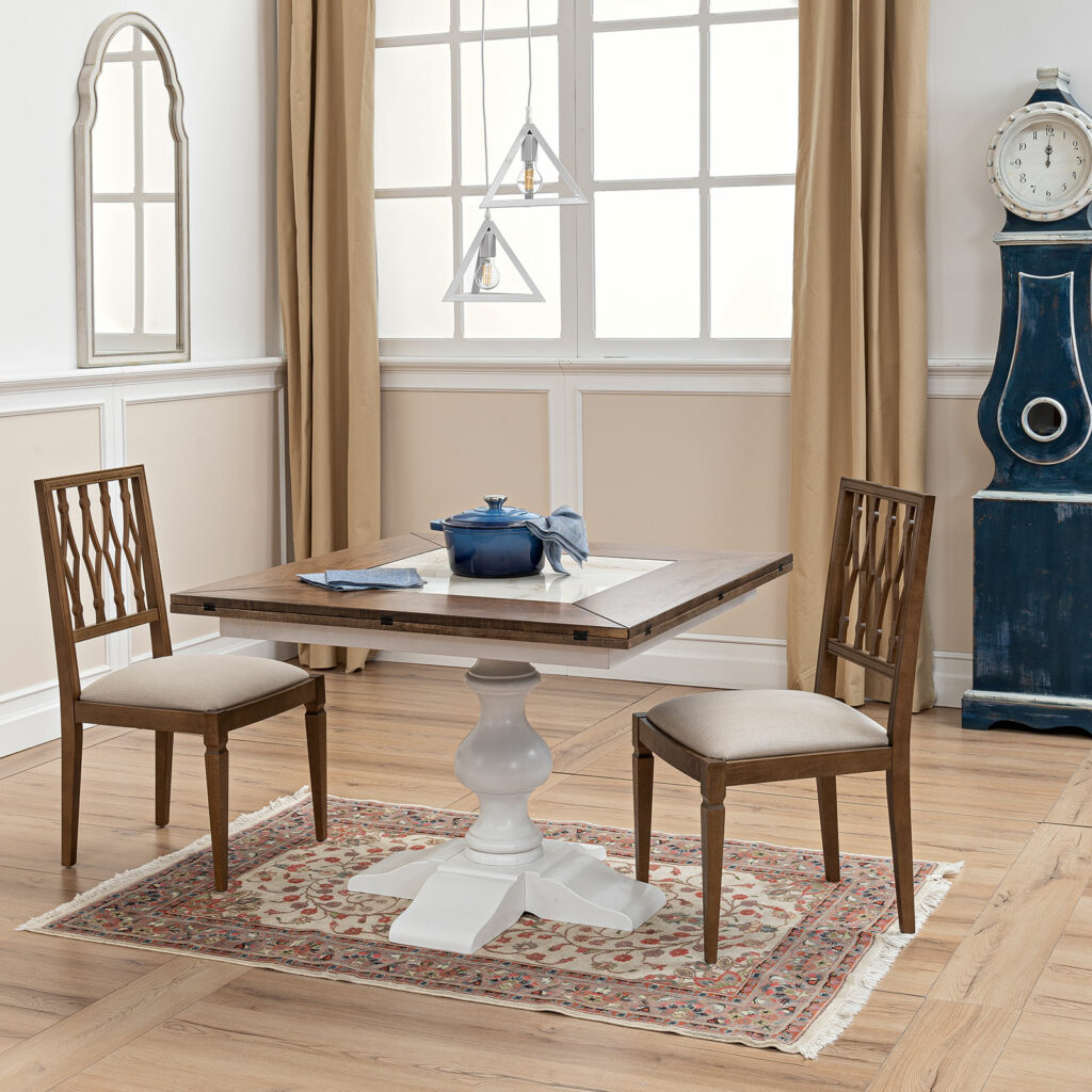
This refers to the colors that are opposite from each other in the color wheel. This technique will certainly help to add strong accents to your decor. This doesn’t mean that there must be a perfect quantity balance between the colors you’ve chosen, otherwise, the effect might seem exaggerated. Choose a leading color and its opposite color for accents. Take as an example our Federico pedestal table with a hexagonal tabletop with a lovely cortina finish for the base and driftwood for the top, the blue pot, and the blue clock are great examples of strong contrast accents that will surely make a statement.
These are just a few examples of how you can combine colors in any space, and let’s face it, by adding one or more of Casapitti’s Made in Italy beautiful handmade pieces any environment gets only better.